Compose Material Catalog
- 4.0
- Rating
- 100.00K
- Installs
- Free
- Price

 Analysis by App-foxy
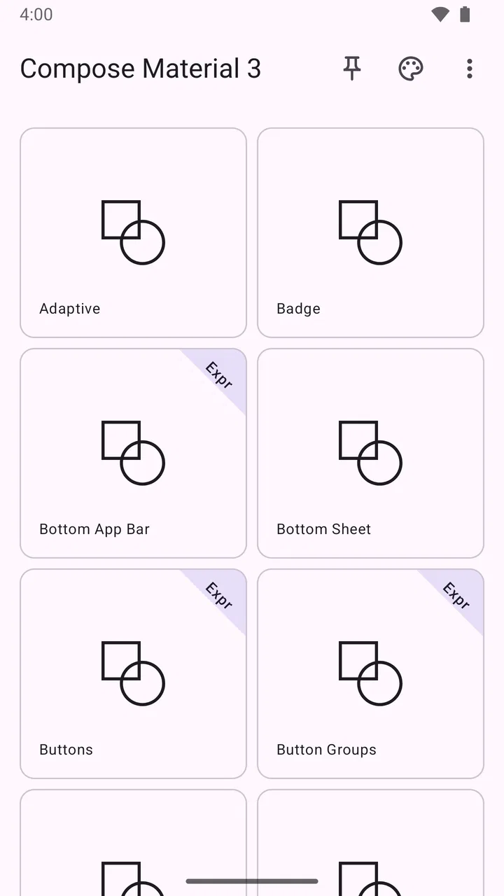
I approached Compose Material Catalog as a practical reference rather than a conventional productivity tool. It is a free Android app from Google LLC in the Libraries & Demo category, built around browsing Material Design examples for Jetpack Compose. That distinction matters: it is most useful when you are building or studying an Android interface, not when you are looking for a general design gallery or a finished app template.
My first impression was that the app makes more sense once you stop treating it like a tutorial with a fixed sequence. It works better as a visual catalog that you can open while making a decision about a screen: how a button should look, how a selection control behaves, or how a Material component fits into a layout. The value is in shortening the distance between an idea and a concrete Compose example.
Finding the right example without getting stuck
The most common point of friction is expectation. Someone opening the app may expect a complete project-building course, a code editor, or a collection of ready-to-publish screens. That is not how I found it most useful. The catalog is better viewed as a companion for developers and learners who already have a question about Material Design in Compose.
You May Also Like

 Blood Strike: 2.5 Anniversary
Blood Strike’s Loadouts Turn Every Drop Into a Tactical Gamble
A close look at Blood Strike’s custom loadouts: how fast access to signature weapons reshapes its battle royale rhythm, rewards preparation, and narrows the gap between fights.

 Pandora - Music & Podcasts
Pandora’s Music Is Easy to Start, but Harder to Recover
Pandora’s strength is its low-effort path from a seed to a station. Its weak spot is how much confidence it asks you to place in connection, setup, and quiet recovery.

 8 Ball Pool
 Is Built on Rivalries, Rematches, and Routine
A close look at the rivalries, rematches, shared routines, and unanswered safety questions that turn a quick pool match into a persistent mobile community.

 Samsung Music
’s Quiet Strength Is Playing What You Already Own
Its reach comes less from spectacle than from dependable access to a personal library. That simplicity is both the app’s strongest retention engine and its ceiling.

 AccuWeather: Weather Radar
AccuWeather Review: A Quick, Clear Forecast for Everyday Decisions
For everyday plans, the best forecast is the one you can understand quickly. AccuWeather makes rain timing, radar, and local conditions easy to act on, with a few trade-offs.

 Hill Climb Racing
Why Hill Climb Racing Still Turns Crashes Into One More Run
A tiny car, a bumpy hill and one more upgrade: Hill Climb Racing keeps resurfacing because its simple chaos makes every near-miss feel personal.
More From Our News Desk



For example, if I am unsure whether a screen needs a particular control, I can use the catalog to inspect the visual treatment instead of relying only on memory or a static design document. This is especially helpful when comparing related components whose differences are easy to miss in a written API reference. Seeing them in context gives me a faster sense of spacing, hierarchy, and interaction intent.
The app also suits a designer who works alongside an Android developer. A designer can browse the visible result and discuss the direction of a screen without first reading Kotlin. A developer, meanwhile, can use the same catalog as a bridge between a visual request and the Material approach already used by Compose. This visual-to-implementation connection is the app’s strongest practical reason to exist.
It is less suitable if you want a broad collection of unrelated interface styles. The catalog is tied to Material Design and Jetpack Compose, so it should not replace a mood-board tool, a platform-specific human interface guide, or a full design system library. Its focus is narrower, but that narrowness is useful when your project already lives in the Compose ecosystem.
What I check before blaming the app
Because the app is a reference tool, a confusing result is not always an application failure. I first check whether I am looking for a Material component or for a complete product pattern. Those are different needs. A component catalog can show the building block, while the final arrangement still depends on the screen, navigation structure, content, and state handling in my own project.
I also make sure I am using a compatible device environment. The listed minimum operating system is Android 6.0, and the current version is 2.5.0. If installation or launching behaves oddly, checking the Android version and allowing the installation to finish completely is a sensible first step before drawing conclusions about the catalog itself.
The app is marked suitable for Everyone, which makes it approachable for students, new developers, and people exploring Compose for the first time. That does not mean every example will be self-explanatory. Material terminology and Compose concepts can still be unfamiliar, so beginners may need a separate learning resource while using the catalog as a visual aid.
Storage and connection checks are also worth handling in a calm order. I would begin by closing the app, reopening it, and confirming that the device has enough free space for normal Android operation. If a screen appears incomplete, I would retry after the app has fully loaded rather than repeatedly tapping controls. These are simple steps, but they prevent a temporary loading issue from being mistaken for a design limitation.
A setup routine that saves time
My preferred setup is to keep the catalog beside the development environment, either on a second device or in a split workflow where I can switch between the reference and the project. The key is to compare one small question at a time. Looking at an entire catalog while trying to remember a dozen details is less effective than checking one component, returning to the code, and testing the result.
I also decide in advance what I am evaluating. It might be the visual hierarchy, the choice of component, the way a state is represented, or the amount of space a control appears to need. This turns browsing into a short investigation instead of aimless scrolling. It is a small habit, but it makes the app feel considerably more useful.
For a learner, I recommend taking a screenshot or writing a short note about the example being studied, then recreating the idea independently. Copying the appearance without understanding the surrounding state can create a fragile imitation. The catalog works best as a prompt for experimentation, not as a substitute for learning how Compose manages layout and interaction.
For a team review, I would use it during a focused design discussion. One person can point to a familiar Material treatment, while another checks whether that direction fits the product’s content and navigation. This avoids a common mistake: choosing a component because it looks attractive in isolation, even though it does not match the user’s task.
Recovering when a browsing session goes wrong
When I lose track of what I was examining, I do not restart the whole design process. I return to the original question and narrow it down again. Was I comparing input controls, looking for a navigation treatment, or checking how a visual state is presented? Reframing the task usually gets me back on course faster than trying to remember every screen I visited.
If a catalog screen does not behave as expected, I separate three possibilities: a temporary app issue, a device issue, and a misunderstanding of the example. Restarting the app addresses the first possibility. Checking the operating system and available storage addresses part of the second. Recreating the example in a small test screen helps with the third, because it reveals whether the problem comes from my own interpretation.
A useful recovery technique is to reduce the comparison to a single component. I inspect its role, then compare it with the closest alternative in the catalog. This prevents a broad visual impression from turning into a poor implementation decision. It also helps me notice whether I am evaluating appearance, interaction, or platform convention, which are related but not identical.
I would not treat a catalog example as proof that a complete screen will behave exactly the same in my application. My project may have different text lengths, accessibility requirements, window sizes, navigation rules, or state transitions. The catalog can guide the starting point, but my own test screen remains the place where I verify the final behavior.
When the problem is really in the project
It is easy to blame a reference app when the copied result looks wrong, but the cause is often elsewhere. A layout may appear different because the project uses different content, typography settings, spacing choices, or parent constraints. Likewise, a control may seem broken when the surrounding state logic has not been connected correctly.
This is where I find the catalog most valuable as a comparison point rather than a debugging tool. I can look at the intended visual relationship, then inspect my own implementation one layer at a time. If the component itself is present but the screen feels unbalanced, the issue may be the container, padding, text, or navigation context rather than the Material element.
The same caution applies to responsive layouts. A reference viewed on one phone does not automatically define the right arrangement for every screen size. I would test the idea with short and long labels, different content amounts, and the device configurations that matter to the project. That extra work is not a failure of the catalog; it is the normal responsibility of adapting a component to a real product.
Accessibility is another area where visual comparison is not enough. A screen can resemble the catalog and still need better semantics, focus behavior, contrast, or touch comfort in the actual application. I use the catalog to understand the Material direction, then evaluate the finished screen as a person would use it. That distinction keeps the reference from becoming a rigid template.
Three workflows where it earns its place
The first workflow is early exploration. Before committing to a custom control, I browse the available Material direction and ask whether an established Compose component already communicates the task clearly. This can reduce unnecessary invention and make the interface feel more familiar to Android users.
The second is implementation review. When a screen looks close but not quite right, I compare the relevant example and identify one difference at a time: hierarchy, spacing, control choice, or state presentation. That is more actionable than saying that the screen “feels off.” It gives me a concrete adjustment to test.
The third is teaching. A mentor can ask a learner to find a component, describe what it communicates, and then recreate a simplified version. The learner gets a visible target without being handed an entire finished application. In my view, that makes the catalog more useful for guided practice than for passive browsing.
There is also a less obvious benefit for teams maintaining a shared visual language. When discussions become abstract, a concrete Material example gives everyone a common reference. It does not settle every product decision, but it can reduce vague debates about whether a control should feel prominent, secondary, compact, or familiar.
How it compares with the usual alternatives
Compared with a written API reference, the catalog is faster for visual questions. Documentation explains parameters and concepts, while a catalog lets me see the result I am trying to understand. The trade-off is that a visual example does not replace detailed technical guidance when I need to investigate state, architecture, or edge cases.
Compared with a design tool, it is closer to the Android implementation world. A design tool is stronger for arranging custom screens, collecting feedback, and exploring brand-specific visuals. Compose Material Catalog is stronger when the question is how a Material-oriented Compose interface can look and feel in practice.
Compared with browsing screenshots online, the catalog offers a more focused and less distracting path. Random screenshots may show attractive interfaces, but they often hide the component logic and may not relate to Compose at all. The catalog’s limitation is also its advantage: it will not provide the same variety as a general inspiration platform.
Compared with starting from a blank Compose project, it gives me a quicker visual anchor. That can be valuable for small experiments and learning exercises. However, it does not remove the need to understand the project structure, dependencies, state, testing, and adaptation work required for a production application.
Who should install it, and who can skip it
I would recommend it to Android developers using Jetpack Compose, students learning Material components, designers collaborating on Compose projects, and developers who regularly need a visual reminder before choosing an interface element. It is also a sensible companion for code reviews where the team wants to discuss a familiar Material direction.
I would skip it if I am not working with Android or Compose, if I need a complete design editor, or if my main goal is to produce a highly custom visual identity outside Material conventions. In those situations, a platform design guide, a prototyping tool, or a broader component library would probably serve me better.
The app is free, and its Everyone age classification removes the kind of access concern that can discourage casual learners. It has passed the hundred-thousand-install mark and holds a 3.9 average from around eight hundred ratings, which suggests a real audience while also reminding me that it is a specialized reference rather than a universally useful app.
My practical verdict after using it as a reference
Compose Material Catalog succeeds when I use it with a specific Compose question in mind. It helps me move from “what should this control look like?” to a concrete Material example, and it gives learners a more tangible way to connect visual design with Android implementation. Google LLC has kept the purpose focused, which is preferable to filling the app with unrelated design material.
The main limitation is that the catalog cannot make project decisions for me. It does not replace technical documentation, a design system created for a particular product, or testing on the devices and content that my application actually supports. Beginners may also need patience because seeing a component is easier than understanding all the code and state behind it.
My advice is to install it if Jetpack Compose is part of your current work or study, then use it in short, deliberate sessions. Pick one component, identify what you want to learn from it, compare it with the nearest alternative, and test the idea in your own project. Used that way, it becomes a practical visual checkpoint rather than another app I open without a clear purpose.
For me, that is enough to recommend it to the right audience. It is not a universal Android design solution, but as a free, focused library-and-demo reference for Compose Material work, it fills a useful gap between abstract documentation and a finished interface.
FAQs for Compose Material Catalog
01What is the Compose Material Catalog app?
The Compose Material Catalog is an app designed to showcase the various components and features of Jetpack Compose, a modern toolkit for building native Android UIs. It provides developers with a comprehensive look at Material Design components, offering interactive examples and detailed guidelines on how to implement them in their projects.
02Is the Compose Material Catalog app free to use?
Yes, the Compose Material Catalog app is completely free to download and use. It serves as an educational tool for developers looking to explore the capabilities of Jetpack Compose and to better understand how to implement Material Design components in their Android applications.
03What are the main features of the Compose Material Catalog app?
The app includes a wide range of features such as interactive demos of Material Design components, detailed documentation, and code snippets that illustrate how to implement various UI elements. It's an essential resource for developers who want to learn and experiment with Jetpack Compose’s functionalities.
04Do I need any prior knowledge before using the Compose Material Catalog?
While prior experience with Android development and familiarity with Jetpack Compose is beneficial, it's not mandatory. The app is designed to be intuitive and provides ample documentation, making it accessible to both beginners and experienced developers who are interested in exploring Material Design in Jetpack Compose.
05Can the Compose Material Catalog app help improve my app development skills?
Absolutely. The app is a valuable resource for developers aiming to enhance their understanding of Material Design and Jetpack Compose. By exploring the interactive examples and detailed documentation, users can gain practical knowledge and insights that can be directly applied to their own Android development projects.
Pros
- Intuitive UI showcases Material Design.
- Extensive component library included.
- Regular updates with latest features.
- Easy integration with existing projects.
- Supports dark and light themes.
Cons
- Limited customization for some components.
- May require a learning curve for new users.
- Lacks comprehensive offline documentation.
- Occasional minor bugs in previews.
- Performance can vary on older devices.

Compose Material Catalog
Gallery